P4: Create the media components to be used in the planned campaign
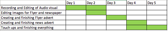
Production schedule
Scrip:

Budget sheet:

|
Flyer flat plan:
|
Improved newspaper flat plan:
|

|

|
Risk assessment:
Unit 20 Risk Assessment by Damian Golik on Scribd
Recee

This is the location I am going use as It looks like a professional studio which would create a positive response from the audience as the video would look better.
Resource requirement:
To create the products asked by the client I will need a computer with video editing software such as final cut pro, photoshop to edit images for the print based products so the flyer for festivals and the newspaper advert, I will also need a camera.
Final cut pro: The reason why I need Final cut pro is since I will need to put all the clips together as well as rearrange the clips so it looks cinematically appealing as well as applying any effects that I would have to such as colour correction so that the shots look better.
Nokia 5: I will be using the camera that is inbuilt into my phone since it has good quality and it’s convenient to bring to my production set as well as it sending the footage to my account straight away which makes it more easily accessible.
Audio visual prduct
This was my original video for my video audio product for the brief but perspectively looking at made me realise how unfitting it was for what the brief was from the unprofessional framing to the cheesy script, I just thought I can do better so I chose to do some research to ensure I can improve from this and make it a lot better and make sure the video audio product is the best I can make it for my client.
Improved version of the script:

The reason why I chose to rewrite my script is because I thought the first one sounded to cheesy and unnatural in the way it was presented so I made this script after researching script techniques as well as camera angles and I think this one sounds a lot better and seems like a more realistic scenario. I'm also going to give the actors some freedom with the script so that they use their natural vocabulary and interpret the script except the essential parts like describing what the envirobox does.
Recee:

After recording my initial video audio piece I saw that the location did not fit the theme of the product and the lighting was not that great and it was obvious that it was artificial so I chose to move to a outdoor scene so that it fits the theme of the envirobox more while also having natural lighting.
Final Audio Visual product
This is my improved version of my audio visual product I prefer this as its less still and includes more camera angles as well as nice scenery which helps in adverts the only downside was the technical difficulties with the equipment where it kept going in and out of focus which takes away from the overall appeal and can be seen as quite annoying.
Extra Research for newspaper advert
From my research about newspaper conventions and from personal experience with newspaper adverts I have considered ways in which I can make my newspaper advert the best I possibly can. I thought a lot about the colours that are used as well as the font and presentation and layout on the page. My conclusion is that my advert should take around ¼ of the page because that way it is noticeable enough but not as expensive as the full page advert, as for the font and colour I chose to keep it plain except for the title which would be green bold and underlined to bring attention to it I also thing a image or multiple of the product is good because for physical products they typically include an image of the product. I also have a slogan and a call to action link that people could type in as its simple and easy to remember. Overall I think these things help my adverts chances of standing out.
Sources
https://www.slideshare.net/ScarabelliV/codes-and-conventions-of-newspaper-adverts-65771169 https://www.slideshare.net/rohama_waseem/newspaper-advert-codes-and-conventions https://fitsmallbusiness.com/newspaper-advertising-costs/
Sources
https://www.slideshare.net/ScarabelliV/codes-and-conventions-of-newspaper-adverts-65771169 https://www.slideshare.net/rohama_waseem/newspaper-advert-codes-and-conventions https://fitsmallbusiness.com/newspaper-advertising-costs/
Newspaper advert
With this product I tried to make it as simple as possible yet give all the information I feel is necessary so what the envirobox is and how does it help the environment as well as the action I want the readers to take. I chose to include only one action button so that the readers go straight to that rather than spreading themselves over multiple platforms.
Extra Research for flyer advert
|
From my research about flyer conventions and personal experience with flyer adverts I have researched ways in which my my advert can stand out among the rest. First of all I had to look for the conventional things flyers focus on which are typography, layout and color these three are the most important as if possible customers are not interested by the flyer then all the detail on it is pointless, and so I thought of using green and white as it links in with my theme of a cleaner way of living and more sustainable so the theme colour is there and it would stand out. The layout is nice and simple so it’s easy to understand and does not confuse any potential customers and the typography is plain and clear to read. Some conventions I saw when researching included a lot of imagery on the flyers so implementing that into my flyer would be good as it would also show the product people would be buying. Overall there are many things that have to be considered when creating a flyer and each is different and there is no one specific way of designing flyers but the contents it includes tends to be the same a catchy title, details of the product or service, images of them as well as company logos and lastly a call to action so a method of communicating or getting access to the product or service.
Sources: https://creativemarket.com/tags/convention-flyer https://www.canva.com/learn/50-brilliant-flyer-designs/ https://sswm.info/water-nutrient-cycle/water-distribution/softwares/awareness-raising/media-campaigns---posters-and-flyers-%28wd%29 https://smallbusiness.chron.com/information-make-flyers-43194.html |

|
Flyer Advert

In a similar fashion of thinking to the newspaper I wanted to give the key information about the product and one call to action button but I made the flyer more colourful by adding green so it stands out more and the green symbolising the theme of the product and it being eco friendly.
Evidence of production
|
This is a screen shot of the editing process which did not take that long as I had a good idea on how I wanted the final product to look like. I chose to use final cut pro as I already had past experience with it so I knew how to use the tools it has.
|
I used a tripod specific for phones so I could use my phone in my production as it has a better quality camera than the ones provided. The tripod is very simple to set up and put back making it ideal for the task as it's easy to move from one place to the next.

|
M3: Explain how the required codes and conventions have been met when creating your media advertising components
The research I have done into similar products on the market was beneficial for the making of my advertising campaign as it allowed me to identify the codes and conventions that professional companies use. I found out that in a large amount of print products imagery is taken well with the audience as it allows them to absorb information about the product in a more direct way as well as looking more appealing, especially if it’s a product that is being advertised to buyers that’s why I chose to include images of my product in both my newspaper and my flyer adverts. I also found out that using colours that are associated with the product is quite successful as people already have an opinion about it and or more likely to be interested in your product alternatively you could subvert expectations by doing something different that way you could also gain audience attention, for my product I chose to do the first thing so I used a mixture of green and white for my flyer and newspaper adverts as they both represent nature and cleanliness.
The codes and conventions I have identified in newspaper and flyer adverts include showing the product and the company name clearly as that is what catches the people's attention and sticks with them, they also include information on the product as well as a call to action this could either be a phone number or a web link to their site or their social media. That's why when I was creating my products I had those codes and conventions in mind to guarantee the success of my product, I included all of the features of the codes and conventions that I thought were needed so the title and showing the product as well as information about the product and the call to action so they know where to go if they are interested. I feel like a call to action is a good idea as it saves time for the people who want to find the product on the actual website rather than going on a lot of different sites and not being able to find it directly and their could be other products called the envirobox made by the public which would have a higher SEO (search engine optimisation). I think showing the product is an important part of meeting the codes and conventions as without it people have to assume a lot of things were as with a reference image they can see if their assumptions are correct or incorrect and this is a method of attracting more people. The title is also a key part as a catchy title can make all the difference in being memorable.
The codes and conventions I have identified in TV adverts include background sound,voice overs, tracking shots, relatable characters as well as text on screen they also include changes in the angles and the product or service they are providing. I chose to include the relatable characters and the changes in angles as I thought those were the key things I needed. My actors were students who were on their lunch break and one of them got the envirobox which would be a realistic scenario and the friend was a little shocked by the strange appearance of his friends new lunch box then the friend explains a bit about the lunch box which interests the friend. As for the change in shots I utilised a convention I found when researching camera techniques which was when changing camera angles do it at 20 degrees or greater for a better effect and I tried to do that to keep the conversation interesting. I chose not to include background music as I feel like it was unnecessary since there was dialogue and the music would not have added that much to the overall piece.
D2 Demonstrate how the advisements technical and aesthetic properties meet the requirements of the clients brief and their preproduction plan.
My audio visual advert meets the aesthetic requirements of the client brief at it shows off the envirobox as a strong and sustainable product which was asked for in the brief, I did this through using a model I made, which also had a fancy design that the consumer may enjoy which meets the criteria of the product being “fashionable, fun and friendly”. In my video I used conventions that I found during my research in LO2 these conventions include being outside as it shows it’s “eco-friendly” as well as recording when it’s sunny as the sun connotes happiness, I also recorded with a lot green colours around as well as having plants in the background both of these are associated with nature and being eco-friendly.
During the recording my actor mentioned all the benefits of the enviro-box that the client brief mention such as the enviro-box profits contributing to “coast guards” which means both cleaning up the coast and protecting it in the future which is the message that would be necessary to give to the audience. While recording I also used conventional video recording techniques such as including multiple angles to diversify the view so it’s more interesting as well as using a setting on my phone that I found through my research in LO2 that helps in framing shots better. I also used the colour filter in final cut pro to increase the saturation of my shots so that it appears more colourful and vibrant I did this as it’s a common practice in advertisement to make your product look better in the adverts.
When creating the newspaper advert I considered the typical adverts you may see in a newspaper and the logistics of the size and colouring of it as that will play a large role in enticing possible customers. After that I looked into some examples and the conventions of newspaper advertisement as well as recalling what I did in my previous unit to create a “fashionable, fun and friendly” advert, I do this through utilising the green colour for my title as well as showing off the design of the envirobox, I also included a call to action which is the link to the website of Global Earth as this way customers will know where to look for the product and any more information.
When designing the flyer advert I chose a colour scheme consisting of white and green as white connotes good and purity while green connotes nature and being eco-friendly which are ideologies the product embodies, it also fits with the briefs description of being “fashionable, fun and friendly for the environment”, similarly to the newspaper advert I chose to include the design of the envirobox as it demos the product for the audience before they buy it.
